
MagPies | Plant-Based Pies with a Sprinkle of Edge

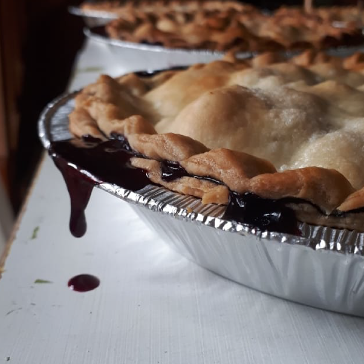
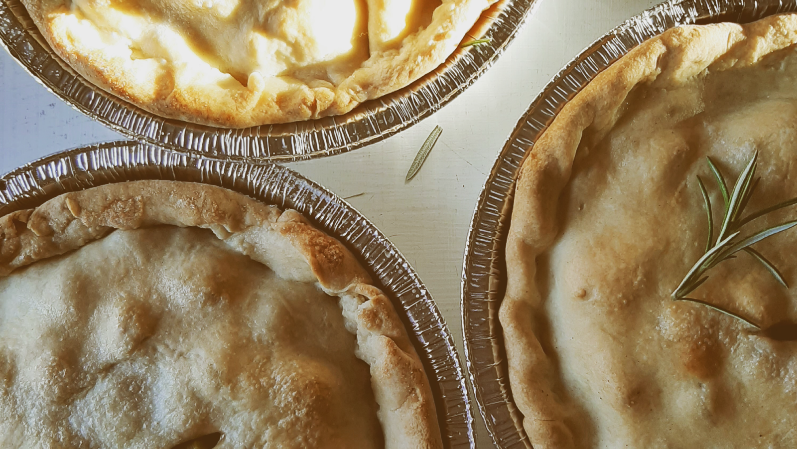
MagPies was making plant-based seasonal pies using locally sourced ingredients. When Cathy contacted me I was very excited to start this project. Vegan pies? Sign me up! We decided to design a brand system with logo variations for each season. The primary application for these logos would be on MagPies’ pie labels, so it made sense to have a transitional system that would be used as visual cues for each new season.

Goals
MagPies wanted a facelift to create a more “hip” brand system that appealed to the 20-30 crowd. The Magpie needed to stay a part of the brand, but in a way that it could illustrate transitioning through seasons. MagPies offers seasonal pie subscriptions that are often in line with cyclical farming practices, as they source local ingredients from local farmers. We needed to represent pie, seasons, and growth/change.
Deliverables
Brand Identity Design
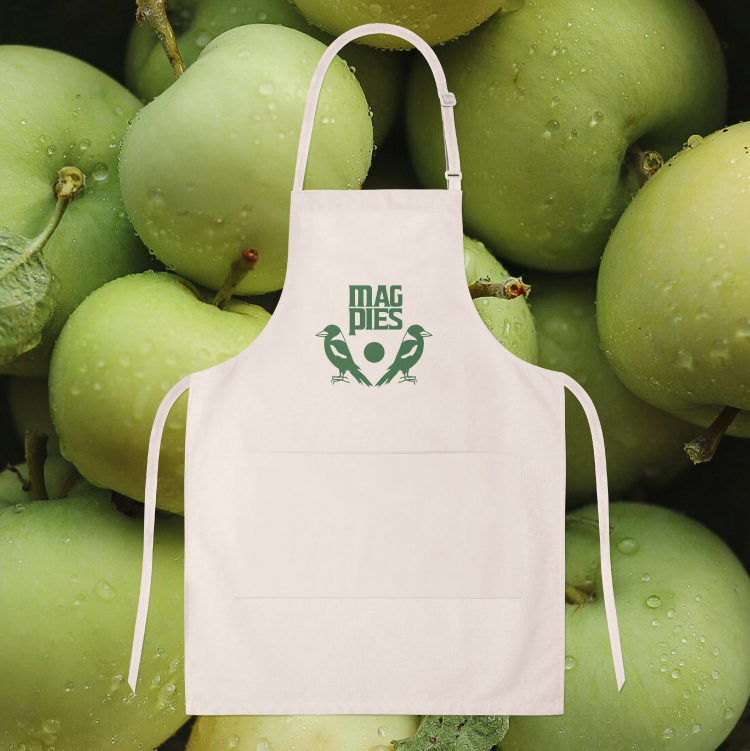
Label Design
Stationery Design
Web Design

Before

After
Solution
We took the idea of the magpie bird and expanded on it for the rebrand, showing it in different forms and stages. The circle represents the moon but also hints at the circular shape of the pie. The colours are natural and seasonal representing fresh flavours and earth tones. During discovery and research, I discovered that Cathy loves rock album covers and posters. She also related MagPies to Mary Poppins. It was clear that we should take the often traditional branding that bakeries have and give it a bit of an edgy twist. We did that by using clean hard lines and some font inspiration from The Beatles, The Rolling Stones, and ACDC while adding a sprinkle of whimsy.

Animated gif for MagPie’s pie delivery service.

A gift card and holder for gifted pie deliveries. The design included instructions and was printed on 100% recycled card stock here in Nanaimo, BC.
Application
After the brand identity system was designed, it needed to be applied to stationery such as gift cards, labels, and Cathy’s website. The goal was to create a simplified system for her labels that could be used for multiple flavours throughout the seasons.


I designed a transitional label system that could be changed throughout the seasons. Fall: Green represents new growth and harvest. What’s more of a classic fall pie flavour than green apple? Fall is also associated with: changing leaves, fall forest walks, crisp smells, herbs and spices. Winter: Teal represents the cold of winter. Winter flavours often include heartier and more savoury vegetable pies like pumpkin or meat pies to comfort you on a cold winter day. Spring: Spring brings blossoms, the beginning of summer fruits, and the more cheery colours we are happy to see after the long rainy west coast winters we are used to. Spring pies? Rhubarb! Summer: Summer brings the warm sun and evening golden hour tints. We associate summer with fresh bright fruity flavours, berries, peaches, etc. These are all represented by the warmth of the colour orange.


Interested in working together?
Every project starts with a free discovery call to get to know you and your goals so that we can discover what you need most, and how to design solutions that represent you best.