
Bristle Brothers | Retro Design for Experienced Painters
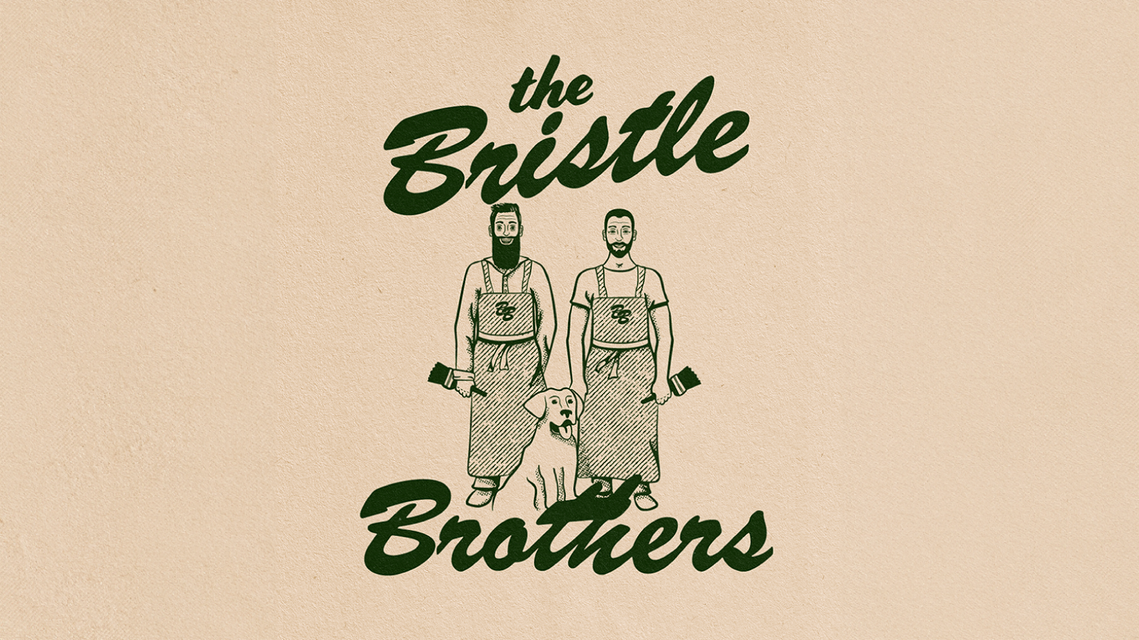
The Bristle Brothers are a brother painting duo based on Vancouver Island, Canada. Chris came to me with the idea of going for a retro illustrated logo concept showcasing him and his brother Nick with Chris’ dog Charlie. I saw the vision right away, I’m always happy to work on conceptually driven brands, in fact, I encourage them! They help you stand out because you’re not trying to be like anyone else. What makes your brand different? What’s your unique selling point? How can we bring your brand’s personality out through the logo and imagery and messaging attached to it?

Goals
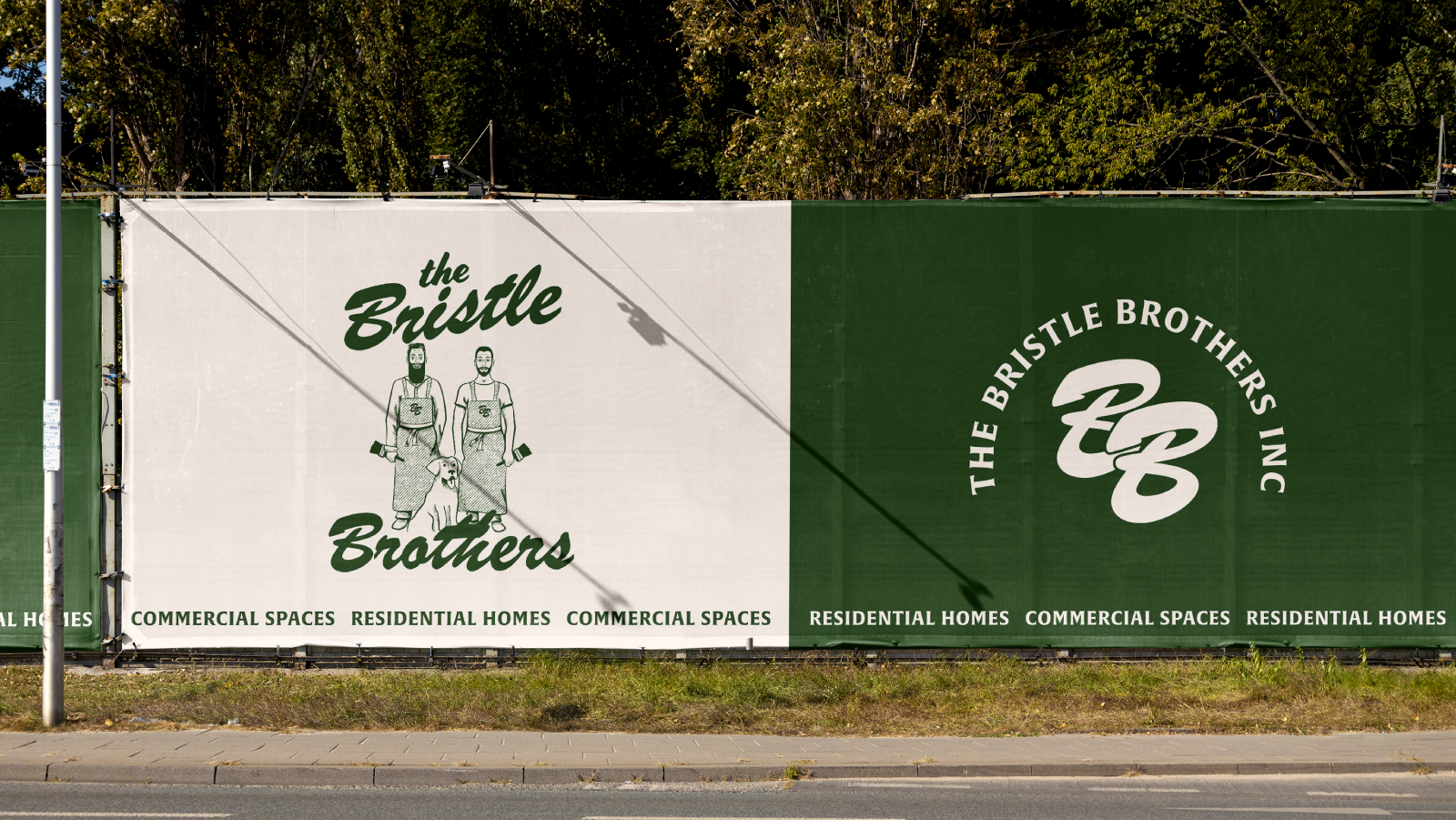
We aimed to design a retro-inspired brand system that communicated experience and dependability. The audience was homeowners and local business owners. Other keywords were friendly, masculine, and cool. The system would need to be applied to multiple contexts like a van decal, t-shirts, business cards, hats, the web, and more.
Deliverables
Brand Identity Design
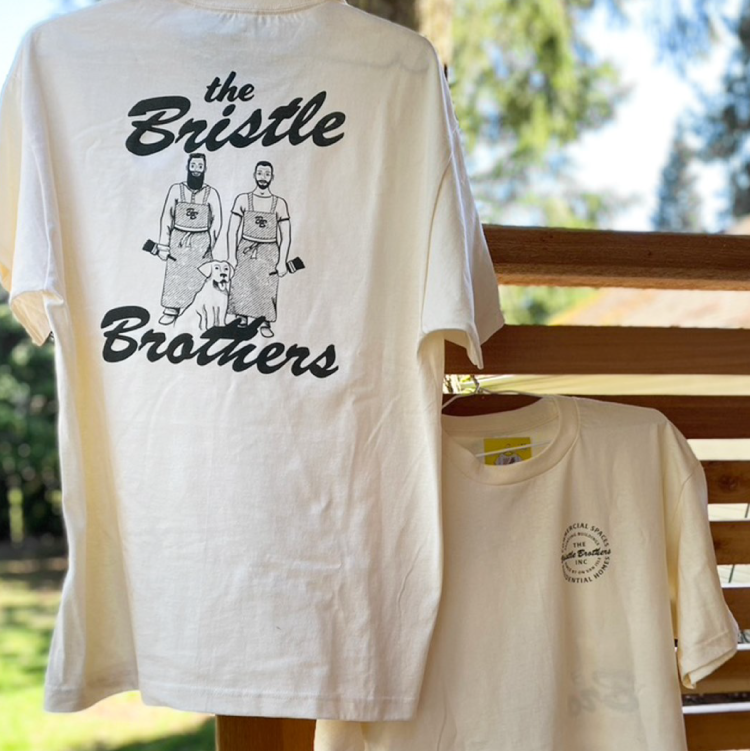
Merch Design
Stationery Design

Horizontal Mark

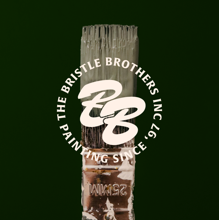
Monogram
Solution
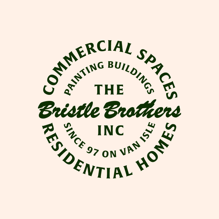
Although I love the maximalist style of the illustrated logo, I knew that The Bristle Brothers would need some stripped back versions of the logo that could be scaled down and used in multiple contexts. Brand systems like this give you a lot of room for applications such as the horizontal mark for the website, to the secondary mark for a mobile site. Thinking about these types of applications are important to make sure you have a strong, consistent, and clear brand presence wherever people may see it.
Badge

Combination Mark
Application
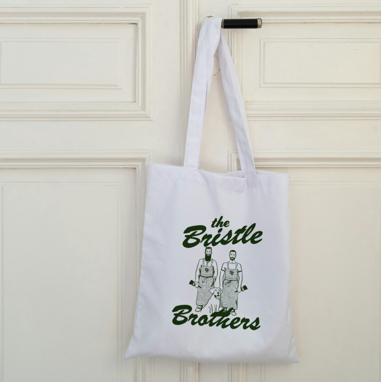
For The Bristle Brothers, we designed a logo system that could be used digitally, on business cards, and on apparel designs. Using a classic brush script paired with a sturdy classic serif font made sense for the retro and trustworthy style we were looking to achieve. The hunter green and cream have strength and nostalgia while also symbolizing growth and success. It helped the brand feel secure and established, like their experience, even though they’re a new startup company. The circular logo stamp provides more context for when the illustration isn’t present. It’s great for business cards, merch, and social media avatars. The style was inspired by old stamps and some Harley Davidson designs. It toes that line of vintage, modern, and masculine design. It feels strong and anchored.


Interested in working together?
Every project starts with a free discovery call to get to know you and your goals so that we can discover what you need most, and how to design solutions that represent you best.