
Queens Liquor | Branding Fit for a Queen… or Two

~ This is a hypothetical personal project ~
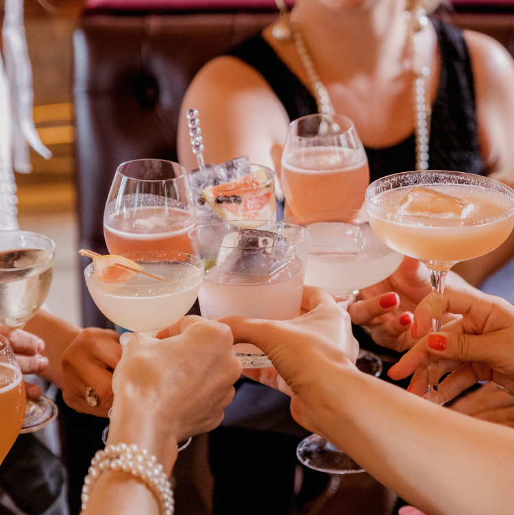
Queens Liquor is making high quality hand-crafted spirits that add a little class to your glass. It’s time to start making cocktails that are fit for a queen… or two.

Goals
The goal for this project was to design a brand that was high-end, luxury, and hand-crafted. It should feel warm but also celebratory. A bottle that you’d reach for on a special occasion. The packaging should display well, stand out against competitors, and be flexible with ever-changing flavours.
Deliverables
Brand Identity Design
Merch Design
Signage Design
Stationery Design


Solution
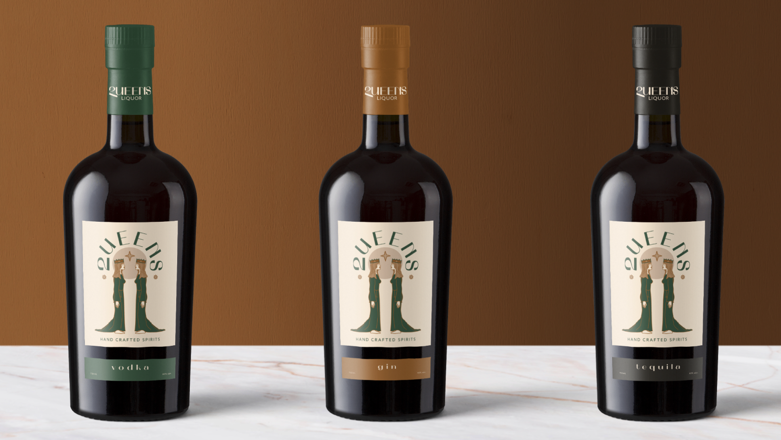
The illustration came first, a reflection of a queen. Seeing the 2 queens face each other I immediately thought about the cursive Q. To me, it has often looked like a 2 when written out. The symbolism of this made a lot of sense for this brand. Typing out the 2 wasn’t enough, it was too narrow in comparison to the rest of the letters, so I customized it to fit the wordmark better. I gave the bottom crossbar an angle to echo the angle of the tail of a Q. The final solution is a unique and scalable wordmark accompanied by a Q monogram crowned like a queen.
Application
After the brand identity system was designed, it needed to be applied to glasses, signage, print, and digital. The use of gold foils elevates the finishes to something special. The label system uses one common label for the top, and an interchangeable one-colour option for each of the liquor types. This is a cost-effective and simple option, especially for small-batch makers. Cheers!


Interested in working together?
Every project starts with a free discovery call to get to know you and your goals so that we can discover what you need most, and how to design solutions that represent you best.