
Danley Construction | Brand Identity Design with Structure

Danley Construction is a family-owned construction company based on Vancouver Island, Canada that was founded in 2006. They work on commercial/light industrial and residential projects. After 14 years of business they felt it was time for a rebrand. Along with a new logo, they were looking to incorporate an abbreviation of their name.

Goals
We were aiming to elevate Danley Construction’s visual identity to design a system that looked confident, professional, and reliable. The logo needed to convey the idea of construction a little bit better through geometry and structure. Their logo system needed to be flexible so that it could be applied to their: website, documents, merch, and signage.
Deliverables
Brand Identity Design
Merch Design
Signage Design
Stationery Design

Before

After
Solution
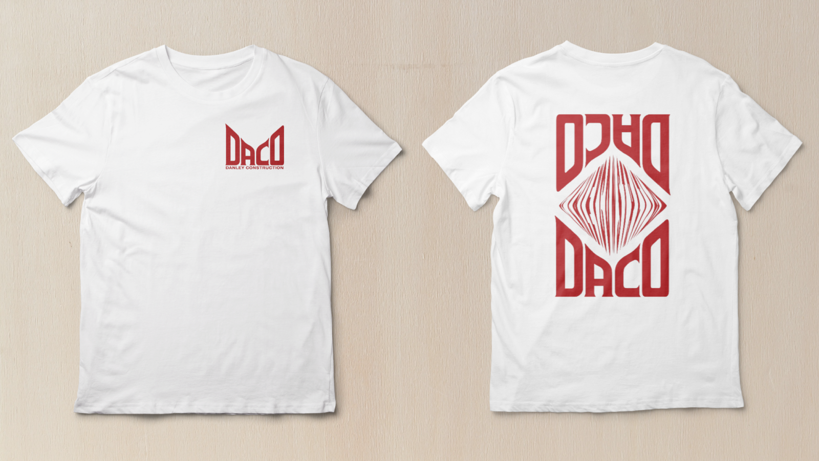
I designed a custom logotype that keeps some of the original logo's 45-degree angles and structural feel. Custom typography is excellent for logos because you can get the exact look and feel to fit your brand while also creating something that is completely unique to your company. The logotype led us to an abbreviation for Danley Construction that is now used by customers and staff. It creates a perfect diamond shape along the top to nest various merch design options as shown below.

The diamond in the middle uses the distorted letters of “Danley Construction” to create this subtle merch design.

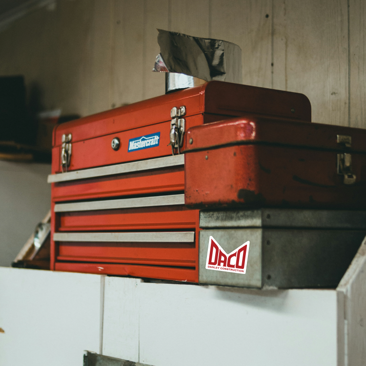
The DACO bear! Inspired by the black bears around Vancouver Island, he’s the DACO mascot. Bears are often associated with family, which felt fitting for this family run business.
Application
After the brand identity system was designed, it needed to be applied to stationery, signage, and merch. The goal for the merch was to design something that could be worn on and off the job site. Is your merch wearable? That’s an excellent opportunity for marketing for your company! Keep your eye out around town, you may just see a DACO sweatshirt in the wild.


Interested in working together?
Every project starts with a free discovery call to get to know you and your goals so that we can discover what you need most, and how to design solutions that represent you best.